Neumorphism is a new design trend that is basically “no harsh edges, only shadows”. It looks gorgeous (see below).
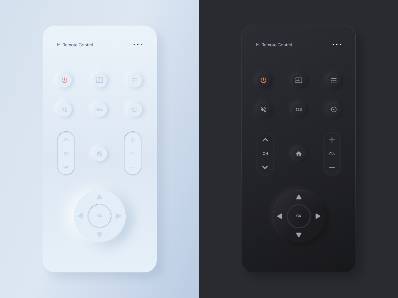
However, this isn’t accessible! It is bad for visually impaired people because it is hard to see where buttons begin and end. Many people think it’s gorgeous – but what about the people who can’t see? In addition, people who have cognitive difficulties may struggle to process how to use it. The author of the article, Uyen Vicky Vo says that “we cannot design for everyone but leave out disabled users”. It cannot be understated how important it is for everyone to have access.
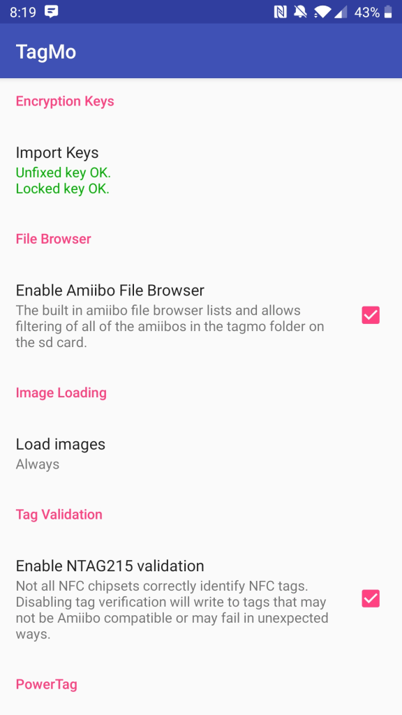
Personally, this reminds me of the TagMo app. The image below shows something that is very hard to use. For example, it doesn’t appear that the part under “Import Keys” is a button – but it is. This makes the app difficult to figure out and use effectively.